
 More Services
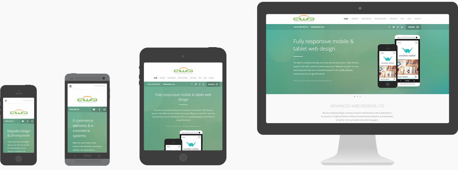
Previously referred to as ‘fluid’ design, responsive design is the process of building a website with the ability to automatically stretch, contract and restructure to different screen sizes, allowing a website to easily and optimally be viewed on any device such as PC's, laptops, tablets and smartphones.

Since the mass uptake of the smartphone in 2007, a vast number of website visitors now browse the internet via mobile devices such as tablets and smart phones, and this is a trend that is only set to increase exponentially as tablets and smartphones become more and more ubiquitous.
In fact, recent reports by Erikson expect smartphone and tablet usage to increase four-fold over the next 6 years and, by the year 2020, smartphone usage is set to top 6.1 billion, with 90% of the world’s population over the age of 6 having some form of ‘smart’ mobile device. That is a lot of potential customers, and an integral marketing opportunity for any business.
Early attempts to tackle this issue revolved around using ‘adaptive’ websites, meaning websites that would detect whether a user was using a mobile devices and display a separate and independent ‘mobile-only’ version of a website.
Whilst this allowed very tailored mobile content, many of these adaptive websites had the short-fall of requiring individual updates to be applied to the multiple, independent versions of each website; additionally, adaptive sites are limited in their ability to work across a range of sizes in the mobile spectrum, often failing to work well on larger mobile devices or smaller tablets. As such, another approach was required.
The idea of ‘responsive design’ was first introduced as a concept in 2009 that allowed different layouts to be applied by CSS (cascading style sheets) based on the width of the device window (viewport); however, as is the case with most major web technologies, the idea could not be properly applied until major browsers had implemented support for multiple, width-based style sheets (also known as media query support, and similar to the technology used to create special 'print' layouts for web pages).
Even when the latest browser releases did support this technology, enough of the general public had to also upgrade their browsers to the latest versions to make the idea a viable investment. Despite major support being established by late 2012, the uptake in websites offering responsive design has been relatively slow, resulting in only 18% of the web’s top 100,000 most visited websites being responsive by 2014.
To combat this sudden and unprecedented increase in mobile visitors, many websites have now begun to embrace responsive design as a default; however, being new technology to many, there is often some confusion as to what responsive design ultimately entails and how it works. Instead, many web developers resort instead to using limiting off-the-shelf ‘responsive’ style-sheets, such as the ‘bootstrap’ package that was developed in tangent with ‘Wordpress’.
The main problem with this is that, due to the diversity of web pages, there simply isn’t a good ‘one-size-fits-all’, and many of these sites tend to have clunky or un-optimised responsive layouts, typically having only 2 or 3 rigid style sheets for set widths (known as viewports) leaving people with transitional screen sizes at an awkward impasse.
Having rigidly formed responsive design doesn’t factor in that there are a plethora of widths of devices, with smartphones ranging in screen size from 3.5 to 6 inches, not to mention when these devices are orientated in landscape and portrait views. Then there are phablets too; and both mini and conventional tablets - which themselves range from 7-12+ inches; laptops and large desktop and ultra-definition monitors. This huge range in sizes necessitates a very diverse, dynamic and non-rigid responsive design.
Additionally, retrospectively implemented off-the-shelf responsive designs packages often don’t properly re-order or prioritise content in different viewports, for example when content is re-structured from multiple columns on desktops to single columns on smaller, mobile devices.
At Advanced Web Designs, we develop all of our websites responsively from the outset and from the ground up, and we simply do not cut corners. Our responsive style sheets work fluidly to the width of pages, and are thoroughly tested not simply on two or three devices, but carefully across a huge range of screen sizes, operating systems and resolutions.
Other benefits to purpose-built and bespoke responsive solutions is that you can also have much better control over content size and load speed. Large full-screen image-heavy carousels can look great on widescreen desktop browsers where a visitor is likely to have a fast, grounded Internet connection, but on tall narrow mobile screens these carousels can look quite odd and be fairly impractical.
Due to the comparatively slow speeds of many mobile Internet connections, these large images can be slow to load, disengaging users from the content. What’s more, such large images on mobile devices are often wasteful of data as many of the intricate details will be lost on smaller screens. Even those who are not put off by loading times can be put off from visiting websites that display larger images simply to conserve their data (due to many mobile phone plans restricting the monthly data usage).
The importance of responsive design goes well beyond the superficial, and can even have a profound effect on areas of importance such as SEO (Search Engine Optimisation). Search engines such as Google take mobile viewing into consideration in their search results and search ranking, and even show in searches performed on mobile phones whether the linked website is mobile friendly or not. Ultimately, this can affect whether or not a visitor will use a website.

Our in-depth knowledge of responsive design and how to push it to its limit, in addition to the high-resolution image solutions we offer (such as SVG incorporation) allow us to mitigate this problem with elegance, and provide customers with slick, beautiful and well tailored websites that look just as great on one phone to the next, and from phablets to tablets, laptops and more!