

Often I see scattered across the web various articles on predictions of design trends, postulating what is likely to be successful and unsuccessful over the coming years. Many of these articles inflate or misconstrue many design principles, offer bizarre or plain incorrect.
In a fit of rage...ahem... British disapproval, I have decided to analyse the top 5 predictions as taken from various random sources around the web, separating the vogue from the vanilla, and assessing how accurate these predictions are likely to be.
Flat design isn’t going anywhere, but that’s not because of any vogue interest or iPhones or Steve Job legacies (brushing aside the fact that flat design achieved mainstream through Windows 8 over a year before it debuted on the iPhone). Flat design isn’t going anywhere because it is simply good design practice.
I have argued many times that design isn’t as subjective as people think (click here) - design follows principles, and one of those principles is the reduction of the superfluous. Good design works to remove any junk or useless information, and so good design will always trend to a form of minimalism, balanced out by the visual flare needed to engage.
What’s more, there is the additional imperative of page speed. Whilst broadband speeds have increased dramatically, the introduction of mobile Internet - tied in with often limited data caps - means that good designers will work to remove unnecessary details from images and text, and display simple, light-weight and stripped down graphics.
This isn’t just a preference - this is an articulated and necessary response to a limitation. This is good design. A fad? I think not!
Example: www.theguardian.com
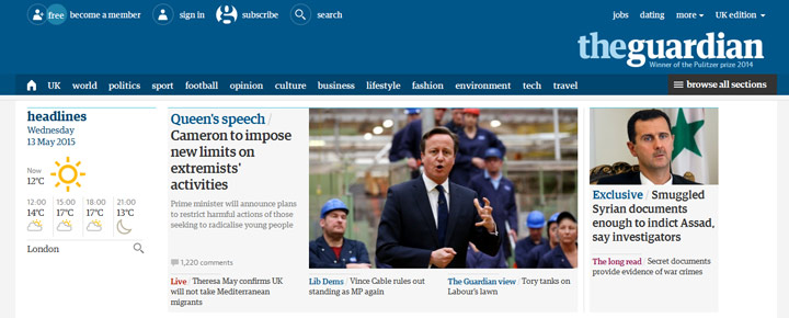
The newly launched Guardian website is, for my money, one of the best examples of successful flat design. Basic but not boring, the website compacts a vast amount of information on each page into manageable and accessible nuggets of information.
This is another given, but again - this isn’t just to pretty up negative space. Icons act as an extension to language and can provide quick indications to users about what they should expect from an area of a website.
Every day, we are taking in more and more data from a wider pool of digital resources. The ability to skim through and easily extract useful information in this highly-competitive digital world is good design. Icon packs allow this.
Example: www.archivedocscan.com
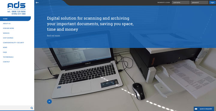
The ‘services’ page uses custom-designed icons to not only quickly distinguish between different services, and also provides some visual clues as to what that service entails.
Following on from using icon packs to elucidate large quantities of information quickly and easily, white space is an important design tool used to separate out content and make the intake of content easier for a user.
When skimming content, large blocks of text with long line-widths are hard to read. Text that is broken up into manageable chunks, is easier to engage with and - be extension - will more likely cause visitors to actually engage.
There are many ways to break up copy: using borders and vertical/horizontal lines; images and graphics; or even just headings. White space is often desirable in web formats as it is the least data-intensive method. As such, it is the go-to method for many web developers for reasons of pure practicality.
Example: www.apple.com
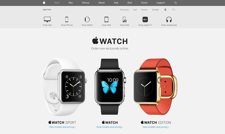
The website in general uses space to an excellent degree. With each new product that is launch apple create a fantastic page to represent it with well spaced imagery and text.
You may think this one goes without saying… but you’d be wrong! Many people are genuinely predicting this as a thing. I don’t quite know what goes through these wannabe trendologists’ minds; perhaps last year they were forecasting for naff, tacky and unrelated stock imagery being the next big thing.
Either way, I think we can all agree that people will always opt for high-quality imagery. Those who don’t are either those who can’t, or those who can’t be bothered, and neither of those groups are going to have much of an effect on the web design canon.
Example: www.mainline-baits.com
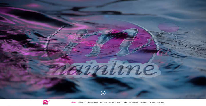
Excellent photos, all unique and self-taken. Whilst the stock-imagery route can be good - you can get some great stock imagery nowadays - nothing beats home-grown.
It was a toss-up between this and discussing high-resolution imagery and vector imagery, but unfortunately a majority of these blog posts are written by copywriters, social media analysts and market research administrators - NOT by front-end developers (who, I can only imagine, are too busy with their noses in their Notepad++).
Whilst the transition to SVG imagery, vector files and high-resolution image support is really one of the next transitions we are likely to face in web design, it’s not a particularly obvious one from a non-developer standpoint. The average web visitor probably isn’t going to be quite anal enough to pour over their phone and check the crispness of the icons on their screen.
It matters, because vectors scale better for responsive websites, and reduce bandwidth. But often this isn’t seen by a visitor. To visitors, it therefore doesn’t matter, and so it doesn’t matter to those writing blog posts to galvanize those visitors.
Big, full-page videos, on the other hand - are pretty obvious and spectacular. Unfortunately, because of this, they have become horribly overused.
Good design adds information, and strips away the junk. Videos can add a plethora of information, if used correctly; but all too often they are used for a simple ‘wow’ factor that is becoming increasingly less ‘wow’. Sadly, this is a trend that is very much likely to continue.
Example: www.londonhomecinema.co.uk
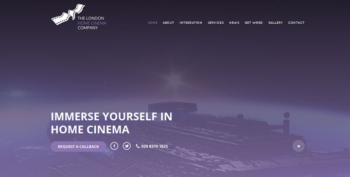
This website shows that video can really add something special, without going overboard. The video is subtle, short and interactive, reflecting the immersive control of home cinema
I have often argued that good design is often the result of limitations. Limitations force us to be resourceful and wasteless, to refine and adapt. If we remove limitations, we remove a major imperative to focus on efficient and well-targeted design.
Some trends in web design - such as videos - are a quintessential example of this problem. With increasing broadband speeds, many web developers are becoming lazy, bulking on flashy but useless junk for a wow-factor that is only impressive to someone who has never seen a web page before - and those people are becoming few and far between.
Nevertheless, some people will always try the same tactics of out-wowing each other in a tit-for-tat, until we have big, cumbersome websites that zip around so much, you get lost in something that looks quite cool, but… well… you have no idea what it is or does.
Fortunately, good designers are still leading the fight, and the web is slowly starting to build up strong, solid conventions and standards, not least because of organisations like the W3C. Many of the trends of 2014 are likely to continue, but because they aren’t simply just trends - they are good design principles; hopefully, they will be used a bit more sensibly though.
The page threw up an unspecified error - please try again


1 Comment(s)
I think what you list here is the trend for last 2 years :) - Reply