No space for empty ideas - the difference between art and design

28th April 2015 at 13:21
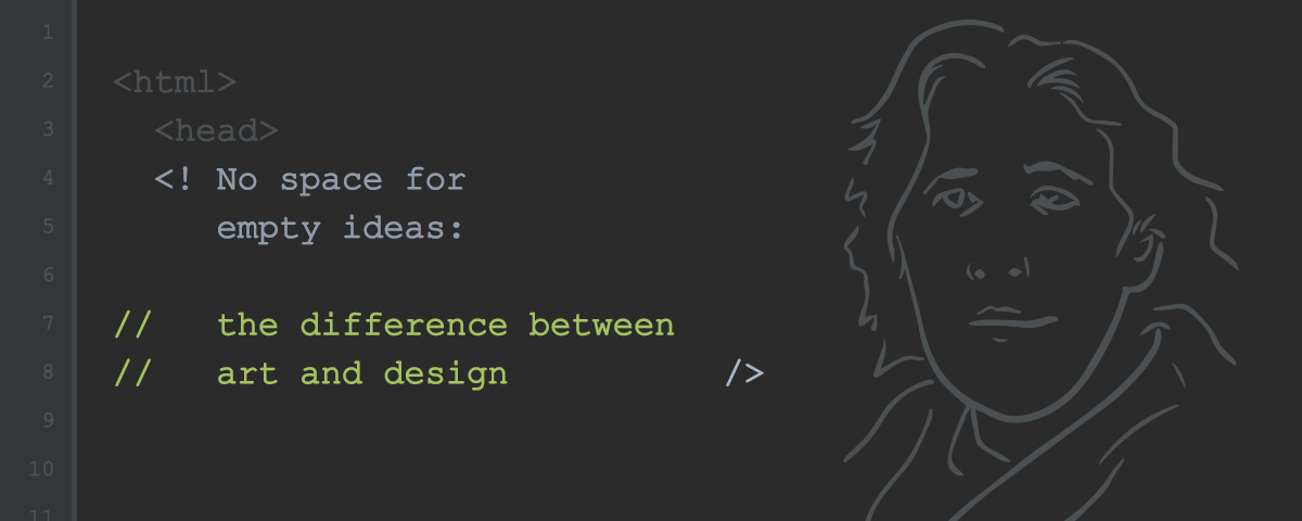
Oscar Wilde once wrote, “all art is quite useless”. Though more accurately, he elaborated, “The only excuse for making a useless thing is that one admires it intensely. All art is quite useless”. What he meant here was quite a simple thing - art is a subject of admiration, something to be observed and to derive pleasure from; however, art cannot have a function - to have a function would stop it being pure art.
This is the principal difference between art and design: design is a process of refinement, it has purpose and logic, processes and iterations. It marries in aesthetics with the principal engineering, it’s true - but ultimately the aesthetics is part of the function of the design, not the other way around! Similarly, art has beauty, but beauty isn’t art.
Design, at its most pure form, acts to engage a user with information or functionality. It acts to distil distractions and subliminally guide a user through a process to a goal. The process of design takes on many forms, but it is little more than this basic idea: design is a reduction of the superfluous.
The easiest way to visualise how good design works is through examples, the simplest being - perhaps - a poster. A poster will use aesthetics and imagery (sometimes misinterpreted as ‘art’) to attract a viewer to engage with piece of information. This is, ultimately, a function. After all, it serves to reason that it doesn’t quite matter how informative a poster is, if no one reads it. And no one will read a poster that isn’t visually engaging.
Further from this, there is the relevance of the imagery used. Photos and illustrations have to be relevant to what the poster is promoting, be that attractive models for a clothing brand, or animals for a veterinary service. The imagery used in a poster acts to quickly single out potential customers by using visuals that a ‘target demographic’ would be drawn to.
Colours, font-styles and font-weights all reflect this. Lighter, more slender fonts may be used for luxury brands or perfumes, whilst thicker, bolder fonts may be used for more rugged product marketing, such as those aimed at more masculine markets. Pinks and reds will typically be used for female markets, and bright colours for children. All of this follows a process of market analysis, so that posters will engage quickly with the target market.
Then there is the content itself; similar to before, it doesn’t matter how engaging or inspiring the visuals of a poster are if the information on it is missing or hard to decipher. If a viewer becomes disengaged by having to try too hard to find the information, you will likely have lost that viewer for good.
More so, there is structural hierarchy of content. The most important wording on a poster must be the most prominent, and the message of the poster must stand out above all else. With a well-designed poster, the various font sizes reflect this.
As such, whilst a poster can be seen as a work of art, it follows a much more an iterative process, with almost every decision being justifiable. You can have good and bad design, and you can have a good and bad poster. Personal preference doesn’t need to come into it to work this out.
Web design is perhaps even more specific a process, as design requirements are much more stringent (due to various compliances and technological restrictions) and competition is much more rife; after all, the average website has between 7 and 12 seconds to captivate a user.
Perhaps foremost, there is the issue of compatibility. With many users accessing websites on old or even antiquated devices, running on operating systems and software years or decades old, design must be backwards compatible to meet the abilities of older devices.
For larger companies, such as those with large or international user of subscription bases, this can cause real issues when ensuring a design is accessible by as many people as possible, including those on older devices, whilst still remaining fresh, modern and engaging.
Swinging the other direction, there is the real issue that if a website deviates too far from expectation, with really radical layouts, many users may become disorientated. Design must, among other things, be intuitive, and huge deviations from expectation cause a real hurdle for many designers in creating intuitive designs.
Even beyond individual users, web content must be prioritised for search engine optimisation, ensuring sufficient and relevant content, social media integration, regularly refreshed information & feeds, and well-structured layouts, syntax and site maps.
Even responsive design - the ability of a websites layout to collapse down for smaller screens - can have huge effects page layouts.
The marrying of new technology and legacy support, tied in with ensuring a design is fresh and engaging, but not so radical that a user becomes lost and disengaged, is by far the most focal aspect of a design.
These considerations have such a strong impact on design that it leaves little room for individual preference. In most cases, almost every visual flare is for a reason, and almost every colour, tint, border, font-size and image placement can be justified.
Good design is whittled down to the essentials, with anything that can distract from the vital information removed or hidden; but a designer must be careful that it is not over-whittled to the point where it becomes blunted: boring or lacking in flare. This leaves little room for anything that isn’t strictly necessary, and certainly no room for anything that is useless. Design, and by extension web design, is far from subjective. And it is certainly far from useless.


1 Comment(s)
I do wonder where design will be in a few years time. Every time I think a road-block as been hit something comes along. I guess it's all down to what's in fashion at the time. - Reply
@Dan Welsh I usually find it's overcoming technological or physical limitations that cause explosions in new design trends. The modern tablet can be seen as far back as Stanley Kubrick's 2001: A Space Oddysee, but it took over 40 years for it to become a reality, and bring with it a new wave of design and design theory. Oh, and Siri was Kubrick-inspired too! ;)